In this tutorial, we will explore how to add drop caps to your ebook using the Jutoh software. For those of you who do not use Jutoh to format your ebooks, you’ll find here some general pointers about the use of custom CSS, as well as some pitfalls you’ll need to be aware of.
But first, what is Jutoh? It is software you can use to create ebooks in Epub and Kindle formats. I’ve used it to generate upwards of 80 books. You can read more about Jutoh here. And, if you are using Calibre, do yourself a favor—switch to Jutoh!
For this tutorial, I’m assuming you already have a Jutoh project ready, and that you now want to add some drop caps, probably with a custom font.
Do I need to use a custom font?
A custom font is not required. You can still have a drop cap effect without specifying a custom font, meaning that the ereader will use its own default font to render the character. But you do need to realize that default fonts vary from device to device, so by not specifying the font you are relinquishing some control.
On the other hand, an embedded custom font does increase the size of your ebook, which means larger “delivery costs” on Amazon sales.
Adding the Drop Caps font
Your first step will be to add the custom font you want for your drop cap. Please refer to our Adding Custom Fonts to Your eBook tutorial for instructions on how to do that.
In this tutorial I’ll also be using CinzelDecorative-Black, as I did in the custom fonts tutorial, but this time I’ll rename the font “Family” to DropCaps. For an explanation of why I like to rename the font family to something consistent with its use within the project, see this post.
Here is a screenshot of what the font setup looks like in my Jutoh project.

Does the copyright allow you to use the font?
If you’ve decided to use a custom font, please check the font’s “embeddability” rights. Just because you have the right to use the font in a printed document does not mean that you also have the right to embed it in an electronic document. When in doubt, check with the font owner.
Using the default Drop Caps character style
Every word processing application has the concept of paragraph and character styles, and Jutoh is no different. Out of the box, Jutoh comes with a Drop Caps character style that is ready for use.
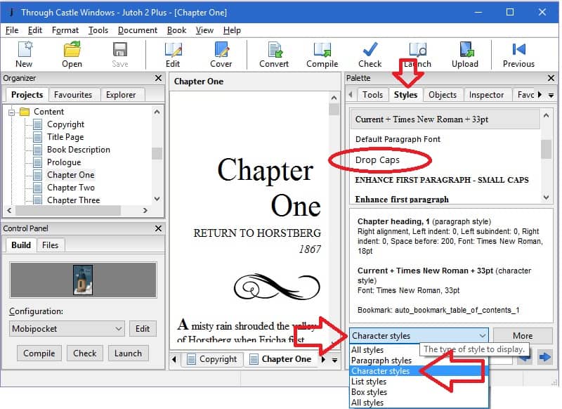
On the Palette, which should be on the right-hand side of the Jutoh window, click the Styles tab, then click the drop down box toward the bottom of the palette window to select the character styles. Drop Caps should be listed in this window. If it is not, drop me a comment and I’ll tell you how to create it from scratch.

I’ve applied the default Drop Caps style to the first character of the first paragraph in chapter one of my book and compiled so I could show you here what it looks like. Note that the default style does not use custom fonts.
From this screenshot, I think you’ll start to realize that there are pitfalls to using drop caps in your ebook. This is not a Jutoh problem; it will happen regardless of what software you use to create your ebook.

Using a custom font
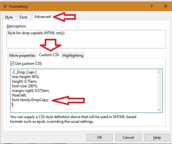
At this point you may want to use a custom font with your drop caps. To do this, you’ll need to edit the style. Once you’ve located it on the Styles tab (as a reminder, the Styles tab is on the Palette, which should be on the right-hand side of the Jutoh window), right click on the style and select “Edit Style ‘Drop Caps'” from the popup menu. On the edit window, click the “Advanced” tab, then the “Custom CSS” tab.
Add the instruction font-family:DropCaps; to the custom CSS box as seen in the screenshot below.

Below are screenshots of what this style now looks like in various platforms.

What is CSS and how does it change drop caps?
We use CSS instructions to create the drop caps effect, so you should have a basic understanding of what it is if you want to tweak its effect.
CSS stands for “Cascading Style Sheets” and is a language used for describing the look and formatting of a document written in a markup language, such as HTML. Every web page contains CSS instructions for your browser (IE, Chrome, Firefox, etc.), such as what fonts to use, whether the fonts are bold or italic, the size of the margins, the colors, etc. A good tutorial on CSS can be found here, and a comprehensive list of all CSS properties here, but we’ll cover the properties that interest us down below.
At its most basic, CSS instructions start with one or more “selectors” separated by commas, followed by an open bracket, followed by one or more instructions separated by the semi-colon, followed by a close bracket. Don’t worry if this sounds confusing; I’ll walk you through it.
The instructions are made of a property name, followed by a colon, then the value(s) for the property. For example, the instruction font-family:DropCaps; says that the font family property is set to “DropCaps”.
Using the styles of CSS to adjust the appearance of drop caps
By adjusting the CSS properties, you can move the letter up or down, change its size, increase or decrease the white space around it, etc.
Here is a set of instructions that I used on a couple Kindle Worlds ebooks that I’m overall happy with, with links to an external site where you can learn more about that property. This example follows the pattern I outlined in the previous section: we first have a selector (.C_Drop_Caps), followed by an open bracket, then a list of additional instructions that are separated with semicolons, all of which is followed with a closing bracket.
.C_Drop_Caps {
line-height: 90%;
height:0.95em;
font-size: 280%;
margin-right: 0.075em;
margin-top: -0.15em;
float:left;
font-family:DropCaps;
}
This is what this set of CSS instructions look like on the Kindle Previewer. But one word of warning: it may look different on the actual device, so download the final ebook and check it on the device.

CSS Properties run-down
- line-height: this will move the character up and down. The higher the percentage, the farther down the character will move.
- height: the height of the box in which the character is to be inserted. If you make this too small, the surrounding text will actually run right through the drop cap character. Use this to “control” how many lines of the surrounding text will be indented to the right. I put “control” in quotes because it is not perfect. In the screenshot above, you see that this setting indented 2 lines on Kindle Fire and 3 lines on Kindle Voyage.
- font-size: how big to make the character as a percentage of the ereader’s default font size. The larger the percentage, the bigger the letter. Make sure to use a percentage here, not an absolute value, because font sizes vary among devices.
- margin-right: how much space between the box where the drop character is going to be drawn and the surrounding text. It has the effect of moving the indented lines away from the drop cap character (larger margin) or closer to it (smaller margin).
- margin-top: how much space between the box where the drop character is going to be drawn and the top of the line. It has the effect of moving the character up (smaller margin) and down (larger margin). Notice that in this example I’m using a negative margin, meaning that I am moving the character further up than it would by default (if the margin had not been specified).
- float: instructs the surrounding text to flow around the drop cap character. You should not change this property.
- font-family: the font to use for the drop cap character.
Drawbacks to using drop caps
If you use a custom font, then a drawback is a larger ebook file size, which then leads to larger delivery costs on Amazon.
But the biggest issue is the impossibility of guaranteeing a consistent look across all ereaders. This is because CSS support across ereaders is sketchy. You might think that if you can create CSS instructions that work well on a web page, then you should then be able to do the same for your ebook, since it also uses CSS to control the display. Unfortunately, that’s not the case. For example, as you’ve noticed from the screenshots above, the Kindle DX ignores most of the instructions and simply displays a bold letter somewhat larger than the default.
Other devices might at least support the limited set of instructions we are using here, but don’t seem to do it consistently. Part of that is because of the fonts surrounding the drop cap (the device’s default font). They are different across devices, so they may have different line heights, different character spacing both on the horizontal and vertical axis, etc.
In other words, don’t expect perfection. If your books are only available on one vendor, such as Amazon, it’s not too much of a stretch to be able to make it look pretty close to what you want on the devices that support it. As you try to support more devices, though, you may find that tweaking it again and again is not worth the trouble. But only you can make that decision.
That being said, we do recommend adding drop caps to your ebook. Done correctly, drop caps make your book look more professional and more appealing to readers.


Drop caps are frustrating in Jutoh. After fiddling with various preferences and wasting too much time, I can’t get them to look as nice as they do in Vellum. Why is that? You say it’s not Jutoh’s fault, but then why does Vellum do them perfectly with ease? Jutoh also needs to make this process easier. First you have to go to character styles to turn on drop caps. Then you have to go to paragraph styles to tell it two lines, three lines, etc. You should be able to go to one place to have it all done at once. This is not user friendly. Bottom line: thank for the post about this, but I’m not yet sold on Jutoh.
I created my ePub in Indesign CC. I found the drop caps I had created did not work. Currently the settings are set to one line and the custom stye is named Drop Cap. This changes to the first letter to the custom style. I am using Sigil to look at the code. I tried erasing that part of the code (near I could figure out and pasting in your settings in several places (minus the s in caps) and always get an error message. This is what the 1st line looks in code currently: Iwas in a place I never dreamed I would be.
I’ve never used Indesign for epub creation, but feel free to email me your screenshot at team@mybookcave.com. I’ll take a look at it.
I was not thinking that the code would simply change in this reply. I have a screen shot for the first line but no means to attach it.
Great tutorial. Thank you. I tried to look for other tutorials, but to no avail.
There’s no search button for your web site. Why?