Your author website is an important tool to connect with readers and to convert potential readers into avid fans. If you want to read some tips that you can use to make it so your website converts readers into fans, check out our blog post here.
In this post, we bring to you examples of websites that are appealing to readers and are effective at getting those readers to stay on the page, sign up to learn more, and buy more books!
To view each website, click on the image.
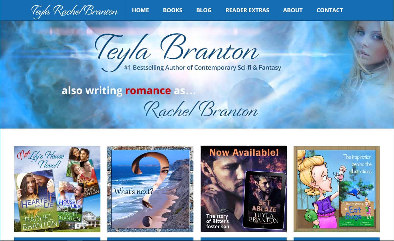
Teyla Rachel Branton Author Website
Right upfront, this website shows beautiful images that draw the reader in, as well as links that invite readers to explore the site, rather than just leave. The easy-to-understand navigation bar adds to the readers desire to continue to explore, and social media links appear in the footer. There is also a signup link for the newsletter on multiple pages, and it explains that by signing up, you’ll get exclusive updates. In addition, a non-intrusive newsletter signup pops up along the bottom of every page after you scroll down. As for the overall design, the text is clear and readable and the colors are consistent (blue, gray, and a touch of red). This is close to a compound color scheme.
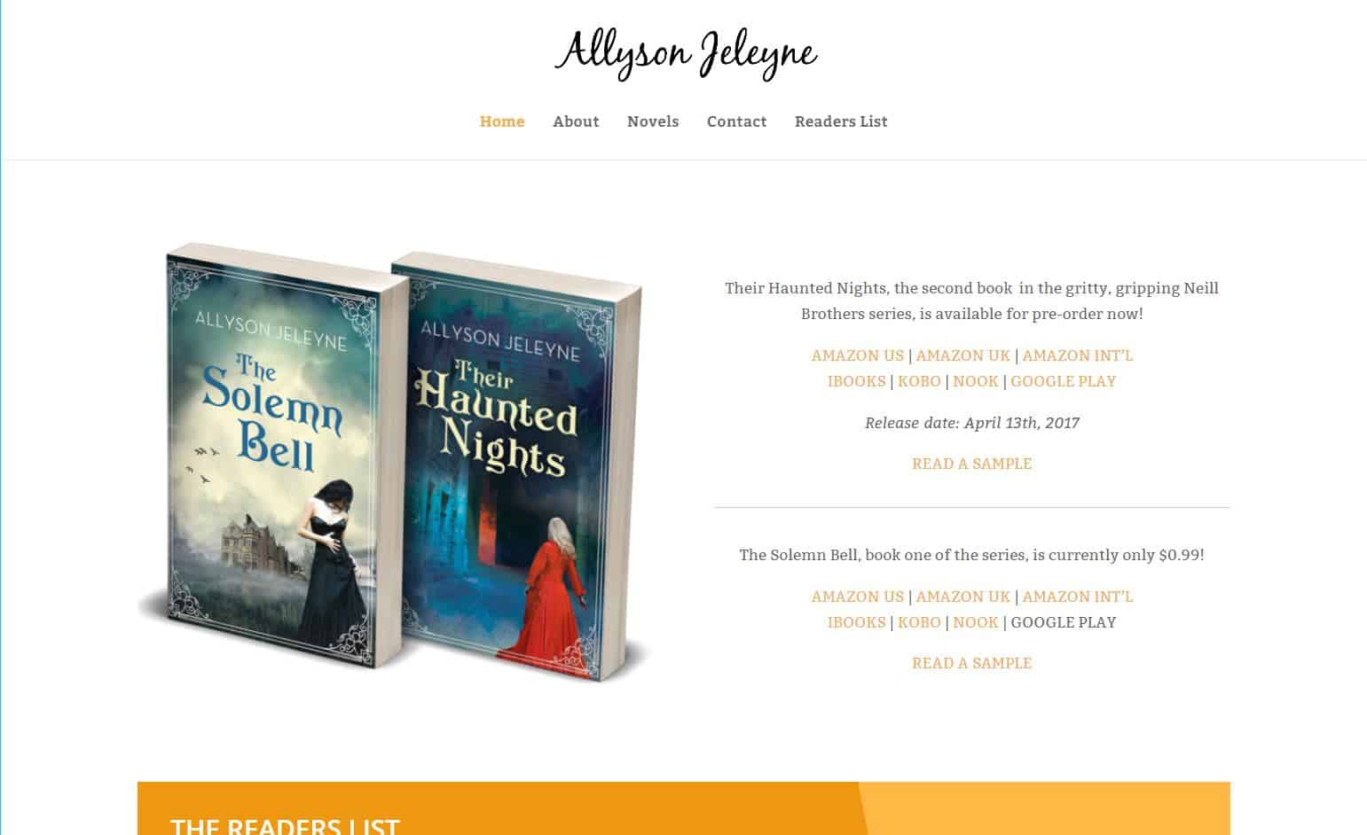
Allyson Jeleyne Author Website
This author’s beautiful book covers are front and center—and let’s face it, readers usually come to your site to learn more about your books, not to see a picture of you, so this was a great decision on Allyson’s part. The books are followed immediately by a bright signup bar, which appears on multiple pages. The site design is very minimalist, which works well: all attention is on the books and the simple white background is soothing to the eyes. The straight-forward navigation bar and the social media links add to that effect. This site also uses consistent colors throughout (gray and orange). This is a monochromatic color scheme.
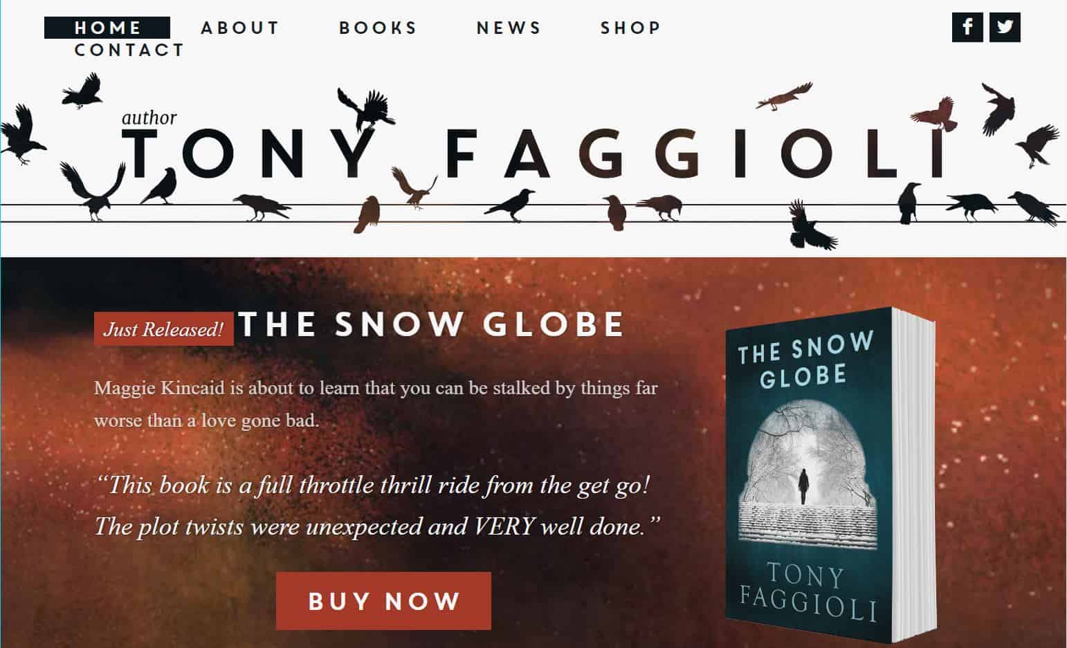
Tony Faggioli Author Website
This site also immediately shows the cover of the author’s newest release, with clear buttons that call for the reader to click on them. Immediately after the books is a newsletter signup that cleverly invites readers to get their free book. This signup appears on every page. This site also has a straightforward navigation bar, and the social media links are at the top, easily visible. The site consistently uses the colors black and reddish orange, making it a monochromatic color scheme.
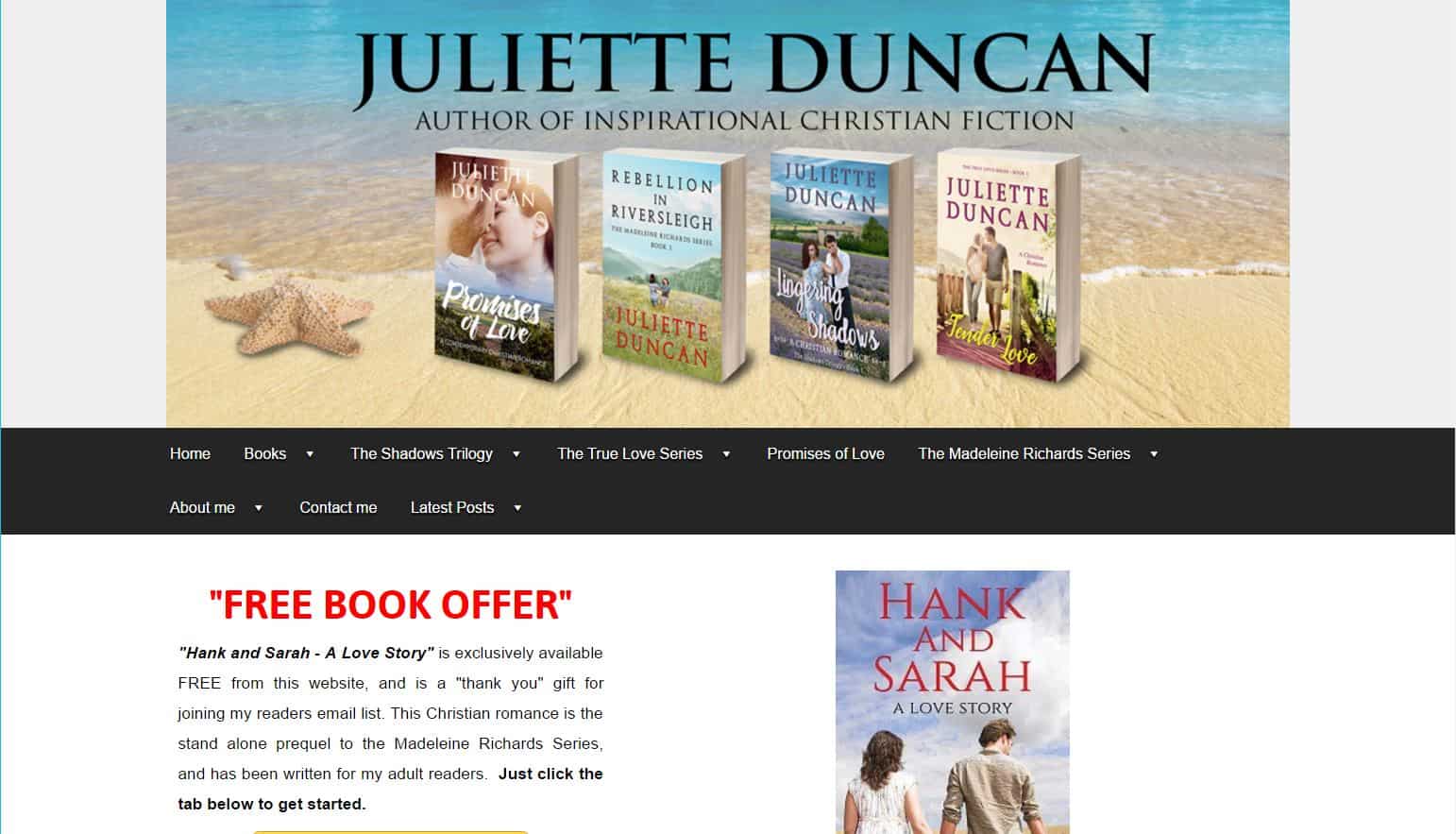
Juliette Duncan Author Website
For the banner image, this website uses images of the author’s books in a very genre-appropriate setting. Right away, the author lets readers know that they can get a free book by clicking on that bright yellow button (if they sign up for her newsletter)! The navigation bar is on the longer side, and may be more effective if shortened. The color theme for this site is gray, red, and a touch of yellow. This is an analogous color scheme.
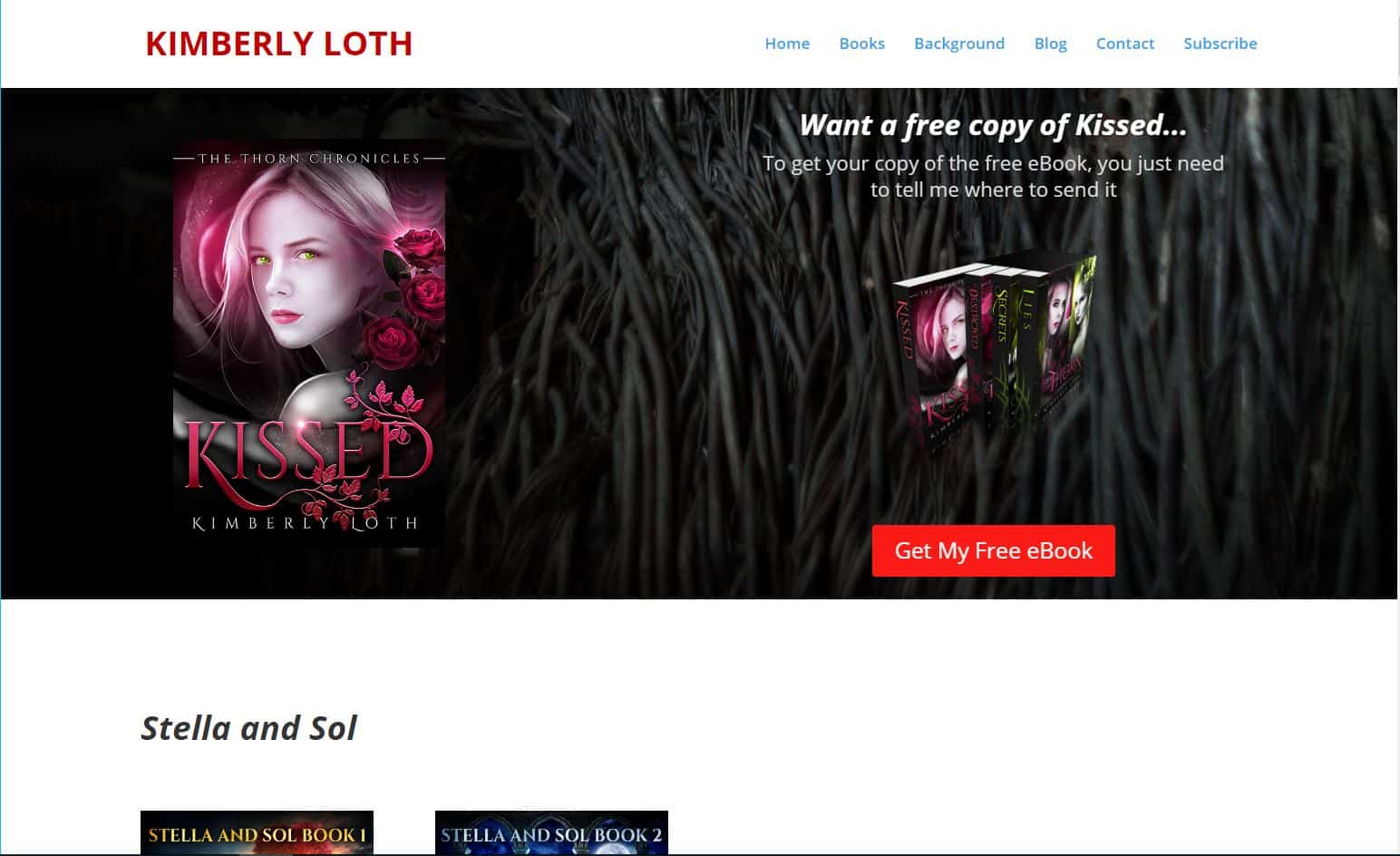
Kimberly Loth Author Website
This author makes her readers an offer right away, in the well-put-together banner image. The red button just calls to be clicked on! She also has another newsletter signup farther down the page, with an explanation of the benefits you’ll get by subscribing. The navigation bar here is nice and simple. Navigation-wise, though, it may be better to break up the topics into separate pages, so readers don’t have to wait for a large page to load and don’t get confused at where a topic ends and where a new one begins. The colors for this beautiful site are red, blue, and gray. This is close to a compound color scheme.
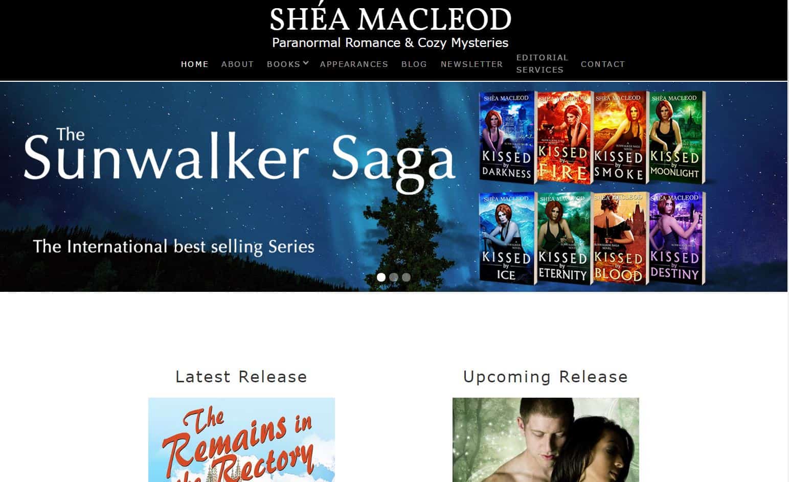
Shea MacLeod Author Website
In this website, the banner image scrolls through different images of the author’s books, which is quite effective, as previously mentioned. The author then lets readers know of the newest and the upcoming releases. Note, though, that including a link on these books would make it more likely for readers to go buy or pre-order the books. Right below is an attractive newsletter signup bar, which explains how you’ll benefit by signing up. The navigation bar is longer than most of the other sites we’ve mentioned, but it is still effective, since each menu item is very different from the other and is relevant. The colors on this site are black and blue, which is a monochromatic color scheme.
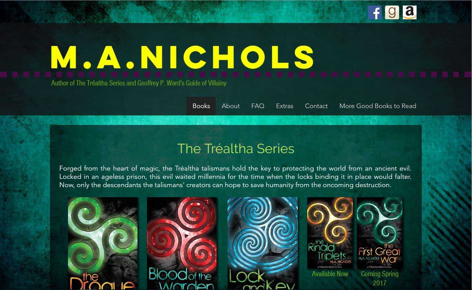
M. A. Nichols Author Website
The home page for this website is the Books page, which is effective because that’s really what readers are interested in, right? At the bottom is a newsletter signup bar. The navigation bar does include the About and Contact pages, which are important for usability. Note that this site, unlike the other sites, uses a bluish green background. This only works because the color is muted and fairly flat. If you place a highly textured image or a bright color as your background, it will be distracting to readers or even painful on the eyes. This site, though, uses color very effectively. The theme colors are green, bluish-green, yellow, and just a hint of purple. This is an analogous color scheme.
We hope these examples give you some ideas to try with your own author website! If you have any questions or comments, let us know below.












Comments