Editors at Book Cave see a lot of variations in punctuation and grammar as we review books before approving them for a content-rated promotion. Correct em dash formation (or en dash formation) is something authors often have problems with in their work. Not in how to use the em dash—most authors seem to understand that—but in how the em dashes and en dashes should be formed. Too many authors are using hyphens without realizing they are in error (they think they are using en dashes as in the Canadian and UK exception below).
However, correct em dash formation is a simple thing all authors should learn as quickly as possible because not forming em dashes correctly screams inexperience to many avid readers and critical reviewers (like poor covers, comma splices, and bad dialogue tags). And you never know who you are going to turn off by not formatting them correctly, so why risk limiting your audience with something that is so easy to fix?
Why it’s Called an Em Dash
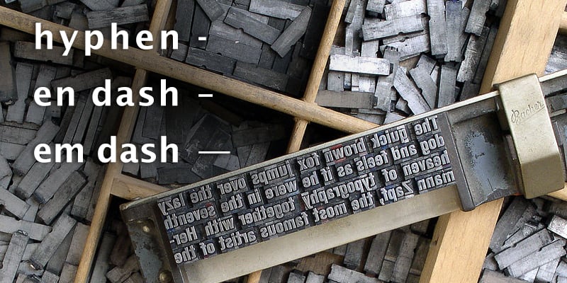
In the old days of manual typesetting (see the picture), the line represented by an em dash was as long as a letter M. There are also en dashes, which are only as long as an N. (Please note that the Lato font we use for this website makes the hyphens, en dashes, and em dashes shorter than many serifs fonts used in print and ebook formatting, so please keep that in mind as you read. For example, on this page the en dashes look close to hyphens.)
Correct Em Dash Formation
In most American print and ebooks, correct em dash formation is done by using two hyphens (with no spacing), which then becomes an em dash (also called the long dash) in most word processing programs as you continue typing. Don’t leave the two hyphens if they don’t merge to form the em dash. In Microsoft Word, you can also use the shortcut ctrl+alt+hyphen (this last key is the hyphen from the number pad, not the regular hyphen). There should not be any spaces on either side of the em dash. You do not use a hyphen, with or without spaces (see hyphens below). However, you can use an en dash in Canada and UK (see the Canada and UK exception below), which may look like a hyphen and spacing if you look at it casually. To learn how to make an em dash in a WordPress blog, click here. Here are some examples of em dashes VS hyphens.
Right: The terrible irony was that I had money—a lot of money—just out of reach.
Wrong: The terrible irony was that I had money-a lot of money-just out of reach.
Wrong: The terrible irony was that I had money–a lot of money–just out of reach.
Wrong: The terrible irony was that I had money – a lot of money – just out of reach.
Right: As long as it didn’t sully her hands or her house—or, apparently, her daughters.
Wrong: As long as it didn’t sully her hands or her house-or, apparently, her daughters.
Wrong: As long as it didn’t sully her hands or her house–or, apparently, her daughters.
Wrong: As long as it didn’t sully her hands or her house – or, apparently, her daughters.
At the End of a Sentence
Right: “This really isn’t—”
Wrong: “This really isn’t-”
Wrong: “This really isn’t–”
Wrong: “This really isn’t -”
Note: An ending em dash that is not inside dialogue is used in the same way but without the quotes.
Exception in Canada and UK—Use En Dashes
Publishers in Canada and some in the UK use the shorter en dash with spacing on either side instead of the em dash. (In America, we use the en dash only to determine a range of something like 1–10 or Monday–Thursday.) There are many ways to create them, but here are three of the most popular. First, you can still use the double hyphen, but with added spaces on both sides. As you continue typing, they will join together and form an en dash. But a single hyphen with spacing also forms an en dash in some word processing programs (like Microsoft Word). Finally, you can also use the shortcut ctrl+hyphen (this last key is the hyphen from the number pad, not the regular hyphen) to create an en dash in Microsoft Word.
Note that the en dash formed with spacing is shorter that the em dash we use in America, but when you include the width of the spacing, both versions end up being the same length between the ending of the preceding word and the first letter of the following word. The en dash, however, is still longer than a hyphen. If it isn’t, it’s not properly formed.
Right in Canada and UK: The terrible irony was that I had money – a lot of money – just out of reach. (En dash with spaces)
Wrong: The terrible irony was that I had money — a lot of money — just out of reach. (Double Hyphen)
Wrong: The terrible irony was that I had money – a lot of money – just out of reach. (Hyphen)
Right in Canada and UK: “This really isn’t –”
Wrong: “This really isn’t –”
Wrong: “This really isn’t -”
Making a Choice between the Em Dash or En Dash?
To avid US readers, experienced writers, and US grammar enthusiasts, an en dash instead of the em dash often looks a lot like a hyphen. It can be distracting to the point that some readers will not finish the book. So determining where you sell the most books is a good way to decide how to format your em dashes. The most important thing is to be consistent. However, if your em dashes are really hyphens, you’d be better off doing a search and replace with a proper em dash no matter where you live.
Improper Variations We’ve Seen
Some authors have become very creative with the use of their em dashes. But unlike with writing, creative use of the em dash doesn’t help readers fall in love with your writing. Here are some variations we’ve seen—some within the same book or even the same sentence.
As long as it didn’t sully her hands or her house–or, apparently, her daughters. (En dash, too short to use with no spaces.)
As long as it didn’t sully her hands or her house – or, apparently, her daughters. (Hyphen)
As long as it didn’t sully her hands or her house–or, apparently, her daughters. (Hyphens)
As long as it didn’t sully her hands or her house-or, apparently, her daughters. (Hyphen)
As long as it didn’t sully her hands or her house- or, apparently, her daughters. (Hyphen and one space)
As long as it didn’t sully her hands or her house -or, apparently, her daughters. (One space and hyphen)
Using a hyphen, however creatively, is simply not correct em dash formation (or en dash) and does not take the place of it in books, no matter how many blogs or newspaper articles you’ve seen using it.
The only correct versions are, of course, the following:
US: As long as it didn’t sully her hands or her house—or, apparently, her daughters.
Canada and UK: As long as it didn’t sully her hands or her house – or, apparently, her daughters.
If you used the longer em dash with spaces, it’s likely no one would object, but writing it that way would mean actually doing it right the first time and then going back and adding spaces, so it’s a silly waste of time. However, we will still promote books with this formating:
As long as it didn’t sully her hands or her house — or, apparently, her daughters. (Again, remember that the Lato font we’re using, this em dash is shorter than it will be in your ebook.)
What Book Cave Prefers
Since we are based in America, we do prefer the em dash formation:
The terrible irony was that I had money—a lot of money—just out of reach.
As long as it didn’t sully her hands or her house—or, apparently, her daughters.
“This really isn’t—”
But we still accept the UK/European variation. Again, the important thing is making sure all the uses in your book are the same. Some authors will assign a single shortcut key for the long dash so they don’t have to type two hyphens. With no spacing and a single key, the em dash becomes as easy as a hyphen or the letter A.
As a side note, the UK and other countries also use single quotes around dialogue, while in America we use single quotes ONLY inside double quotes. You can read all about that here.
A Word About Hyphens
So when do you use hyphens? Well, that probably needs to be another blog post, but the long and short of it is that a hyphen is primarily used to create a compound adjectives before a noun. Here are a few examples below to get you started:
He was a good-looking man. (As opposed to: The man was good looking.)
It was a man-eating piranha. (Without the hyphen it means the man was eating the piranha.)
He was a well-known author. She was a part-time worker. The rain-drenched coat felt heavy. The eight-year-old boy danced the jig. She pulled out a hundred-dollar bill.
NEVER use an em dash in a compound adjective. An en dash can only be used in a compound adjective when one of the adjectives is an open compound or when both are already hyphenated compounds.
Happy formatting!


Em dashes are the standard in Canada, not spaced ens. Spaced em dashes are increasingly common in both Canada and the US since e-readers mistake them for hyphens if they don’t have spaces.
I know that CMOS is the format almost, but not all publishers use for em dash spacing, but I prefer to use spaces before & after for two reasons: 1. It simply looks better; 2. Without spaces, software translators for most Epublishers treat an em dash as part of the preceding and following words; i.e. before–after and does’t allow for a breakpoint. Not a big issue for me since I’m an historian and most of my work is for small journals.
We picture book illustrators are used to a standard print format of 32 pages is there any corresponding average length (number of screens?) for original content?
I love “the hyphen from the number pad”. Known to many as the minus sign. One reason I prefer the Mac is that the shortcuts (Alt-hyphen for an en dash, Shift-Alt-hyphen for an em dash) are system-wide. The Word shortcuts work only in Word, naturally. I’ve seen the en dash used as you describe in some British books. At first I thought it looked odd but I’ve grown to like it, particularly with a sans font.
Sorry to quibble but I wouldn’t hyphenate “well known”, since “well” is an adverb and it’s obvious what it’s meant to qualify.