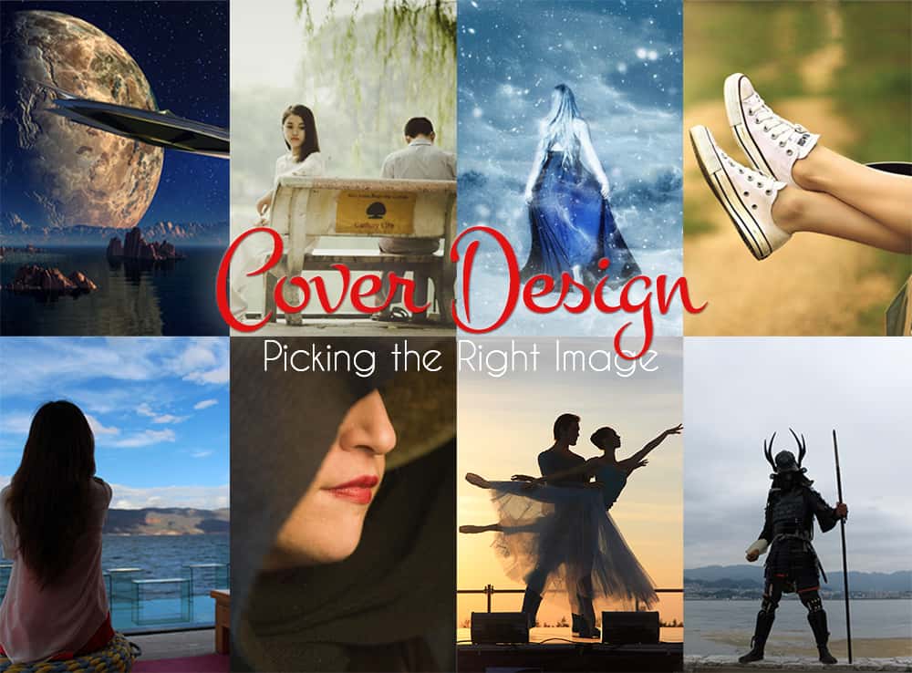
Whether your creating your book cover for print or for ebook, you need to have a strong cover design that looks good small (as a thumbnail) and at full size (on the print book, or opened in the ereader). At Book Cave we see a lot of different covers come through, some great, and some not-so-great, but we’re here to help you make your cover one of the great ones.
In this post we’ll look at choosing a great image. After all, a poor image will turn away readers, no matter how great a font or layout you choose.
Look at other popular cover designs.
Before looking for images for your cover, you need to do a little research on the covers of popular books. If your book is a romance, try looking up romance books on Amazon or Google and see what those covers look like. If you write thrillers, look up popular thriller books. What sells well? What kind of pictures do best-selling authors in that genre use? I find it helpful to take notes that I can look back on later.
Choose an image that relates to your book.
We’re told to “never judge a book by it’s cover,” but readers do it all the time. After all, the cover is their first interaction with the book. So, you want to choose an image that relates to your plot. Perhaps a person who looks like a character in your book, or an item or place that is a big part of your story.
Here are some great examples of covers that use pictures from the book’s plot.


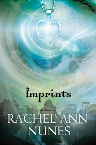
In the first cover, the focus is on the colorful hair, which is a big part of plot. In the second cover, we see the two main characters from the book, which is definitely pertinent to the plot. The final cover focuses on an item that the main character uses (she has psychic-like abilities) to help solve the mystery.
Communicate your book’s genre with your image.
Even if your image relates to your book, you still have a problem if readers looks at the cover of your romance and thinks, “Cool! A horror story!” Oops! This is a good time to look back at the cover design notes you took at the beginning to see what pictures authors in your genre are using.
Let’s look at a few examples. How would you categorize each of the covers below and why?

.jpg)


.jpg)
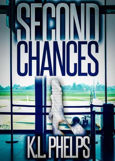
Here are the answers, in case you are wondering:
- Horror
- Romance
- Teen Fantasy
- Women’s Fiction
- Science Fiction
- Mystery
As you can see there is a lot of cross-over between genres, but a lot of genres have a very distinct feel from other genres.
A horror book usually has a darker image on the cover. It can be a person, a place, or a thing, but something must be eerie or out of place. A person’s face on a horror cover is often frightened or grotesque.
Romance books usually display a couple or just the girl on the cover. Books that are more erotic often display scantily-clothed people instead. In a sweet romance, the characters are smiling, often gazing at each other lovingly; in a more erotic romance, the characters have more sensual expressions.
Fantasy covers usually have the main character on the cover, with some magical element shown, whether it’s fairies, magic swirls, cool lighting effects, etc. The character shown on these covers has a more serious and focused expression. Alternatively, the cover may have a mystical landscape.
(Note that in the examples above, there is a varying level of readability of the text on the covers. Text is also very important, but we’ll address that in a later cover post. I just wanted to point out to you the difference now, and remind you that a great image is only one part of the equation.)
Choose a high-resolution image.
Even if you don’t plan on publishing your book as a print book, you should still find a high-resolution image for your cover. Why?
- Just in case you do eventually publish the book as a print book,
- readers will see a larger image of the cover in the ebook itself, and it needs to be good quality, and
- you may end up cropping the image for better composition, so you don’t want to end up with an image that is too small.
But what is “high resolution”? For print, high resolution means 300 dpi (dots per inch), at the full size of the cover. So if you’re cover is 9 x 6, you’ll want to open up your image and make sure it’s bigger than 9 x 6 at 300 dpi (2700 x 1800 pixels) to allow for trim on each side. You can make the image a “higher” dps by resampling it and just changing the dps, but this doesn’t actually increase the quality of the image. All your photo editing program does is copy and paste a few pixels so there are more of them, which still causes pixelation. So do not resample you image to make it bigger (you can resample it to make it smaller, but make sure to save it as a new file so you don’t lose your original resolution). For an ebook, you can go lower in resolution—I wouldn’t go less than 1000 pixels wide—but again, starting out with a higher resolution image is the best method. (For the ebook cover, you will resize it smaller after you’ve finished creating it. You can read more about resizing your ebook cover in our blog post here.)
Get your photo from the right source.
You may be tempted to use your own pictures for cover design. You can do so, but make sure the subject is in focus, the content is interesting or unique, and the photo has a good composition. Unless you have training in photography and good equipment, it’s hard to get such images. Not to mention, you usually don’t use a professional model on personal pictures, which means the model may look awkwardly posed as well. Of course, a good drawing can also be used on a cover, so if you have skills in that area, go ahead and explore that option!
Luckily, there are plenty of stock photos out there that you can use instead.
Using Stock Photos
You can buy photos from stock photo sites like iStock, Shutterstock, Fotolia, and Dreamstime. Sites like these often offer a “free photo of the week,” and sometimes the pictures are really great, so if you’re on a tight budget, make sure to check those out. You can also use free sites like Free Images or Pixabay, but make sure the picture says it’s free for “commercial use.” For a more in-depth overview of some of our favorite stock photo sites, check out this blog post.
When you’re at a stock photo site, you’ll see the option to buy a “standard” or an “extended” license. You usually won’t need more than a standard license, which generally allows you to print an image up to 500,000 times (some sites vary—check license and usage rules for each site). Regardless of what license you have, it is good form (and sometimes required by the image’s copyright) to include where you got the cover image on your book’s copyright page.
If you’re not sure whether an image will look good for your cover, all the stock photo sites allow you to download “comp images” that have a watermark. These are slightly lower resolution images, but generally higher resolution than if you just did a “Save image as” for it. You can experiment with the comp image to see if that image will work before actually making a purchase.
Making Stock Photos Unique
One difficulty with using stock photos is that anyone else can buy that same image for their cover! But you can make your image unique by adding light effects and changing colors in Photoshop (or another photo editor), or by combining more than one image together.
In this cover, the designer combined three photos to give the finished image an entirely different feel. She also added a photo filter, changed the color of the man’s shirt, touched up the hair, teeth, and eyes on the main woman photo, and added a subtle “makeup.” Can you spot the differences?

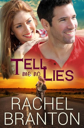
In this photo, the designer combined two pictures, added light effects, a photo filter, and additional grass at the bottom. You can see that a little bit of effort completely changes the original photograph. In this case the main character isn’t blond, but the rest of the picture fit the book perfectly.

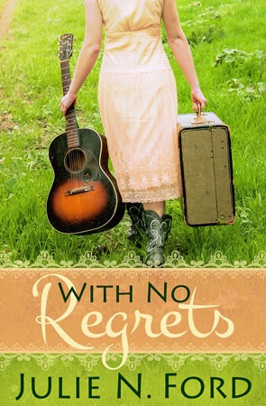
But how do you do manipulate images like this? We’ll talk about that in Part 2.
We’d love to hear your cover tips in the comments below!






I have found an image—an art photo by a Korean artist—which I feel is perfect for my first book of poetry. I have just started up my LLC publishing house. I anticipate a smaller initial production through a POD distributor. Is there a standard arrangement or fee or fee + royalties with purchase of a cover art photo for use as a book cover, given the conditions above?
There’s not really a standard–different images can cost different amounts just because the owner wants to sell them higher. I’d suggest finding a few similar images at a stock photo site and seeing what they cost, then contacting the copyright owner of this image and asking if you can use it on your cover for a fee. Let them know what you’re thinking for that fee, and that you’ll of course attribute the image to them on the copyright page, and see what they say! They may not be willing to sell you usage rights at all. If they are willing to sell, you’ll want a written contract so you can show that in case your copyright is called into question in the future.