
Everyone’s heard the age-old saying “Don’t judge a book by its cover.” Yet, most book lovers will admit to purchasing a book on a whim based on nothing more than its cover.
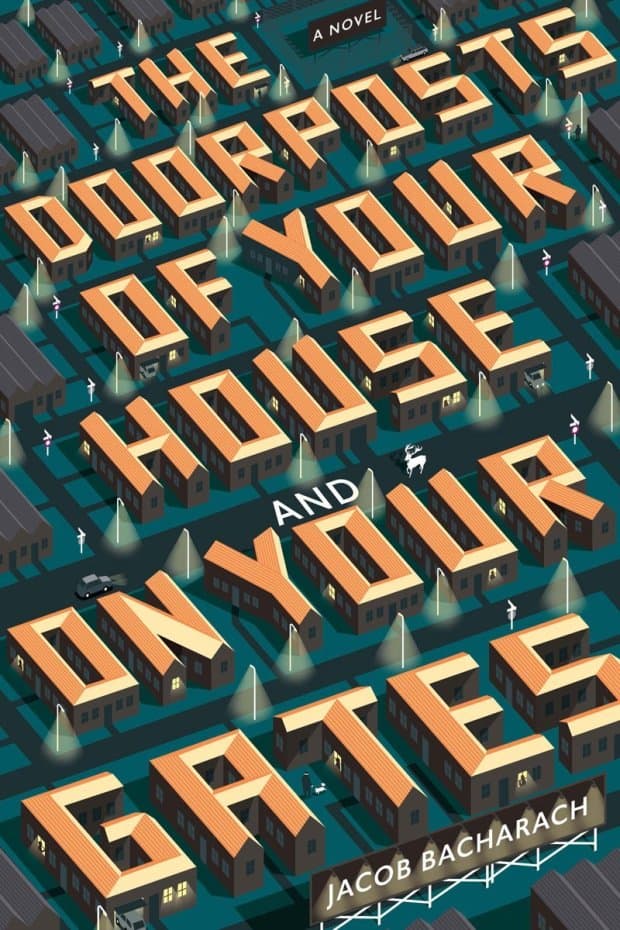
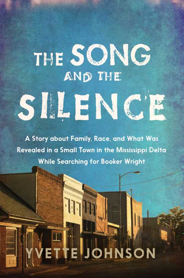
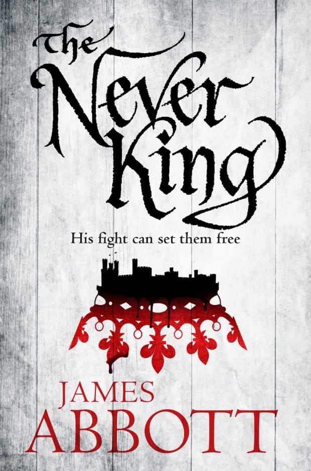
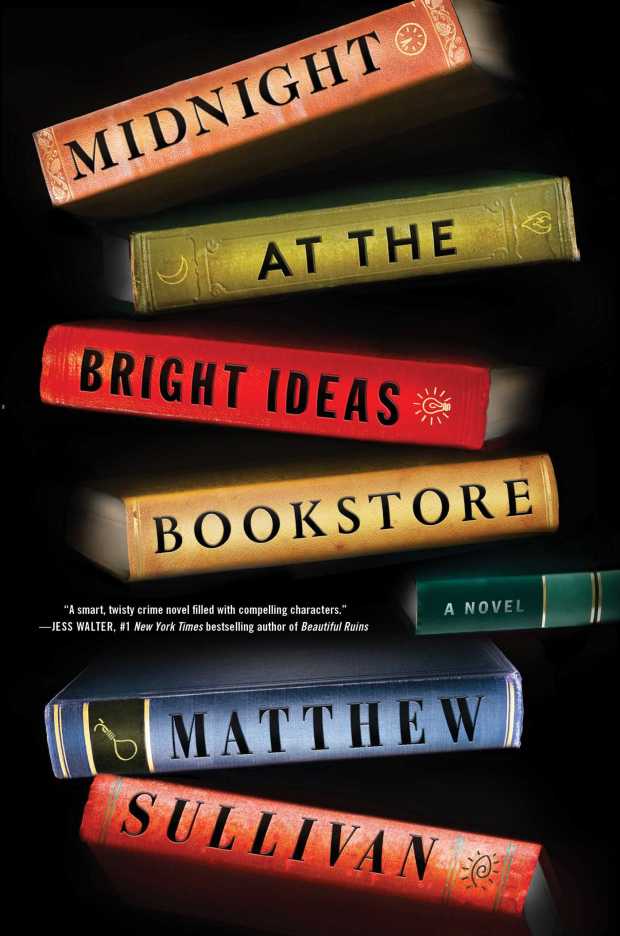
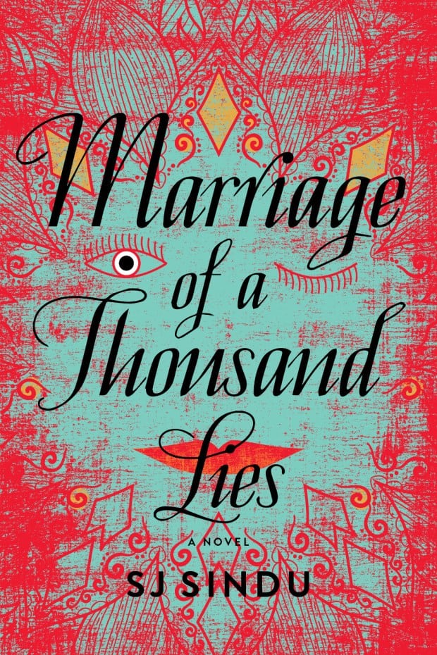
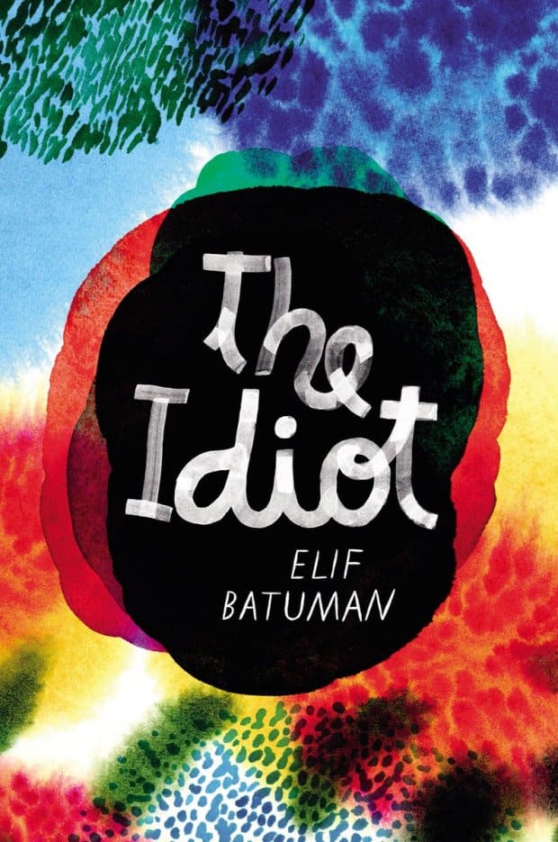
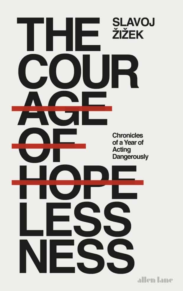
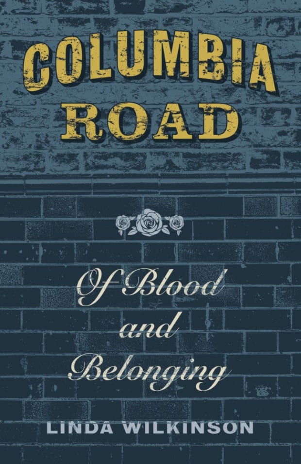
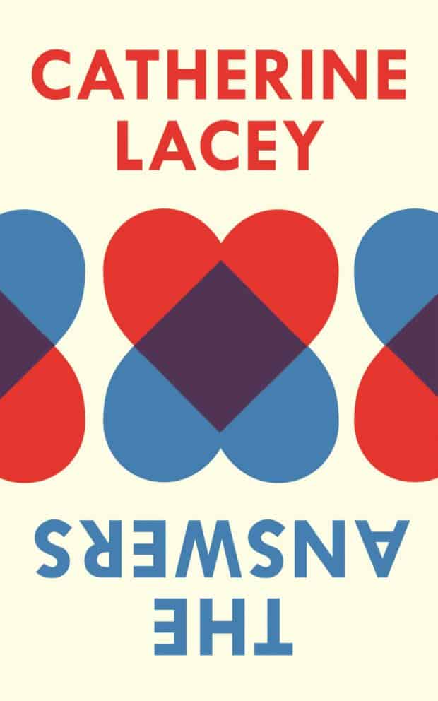
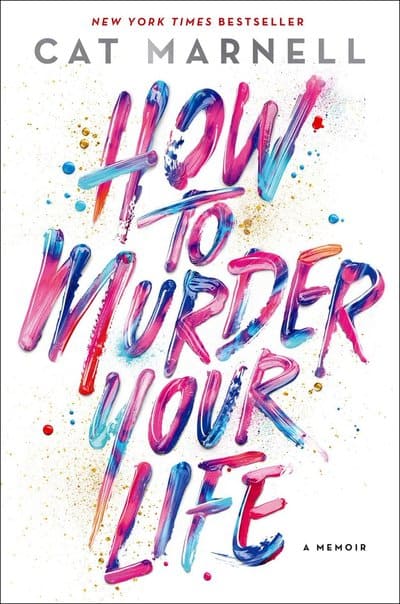
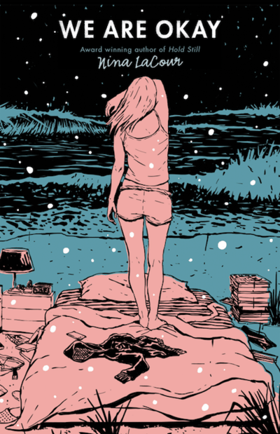
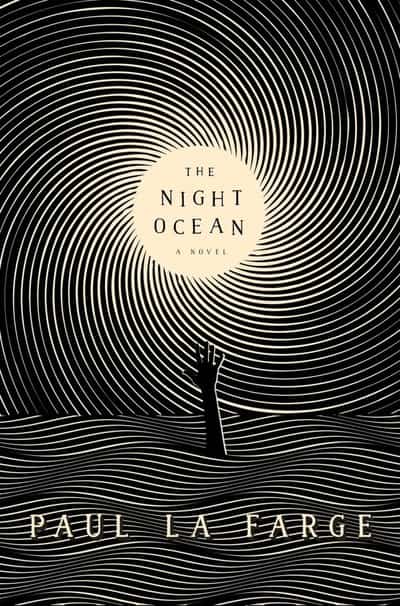
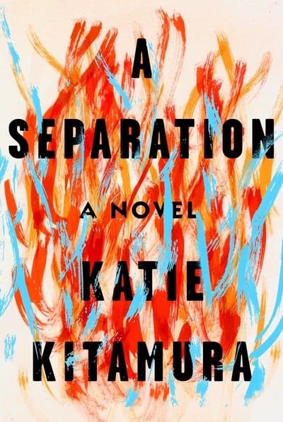
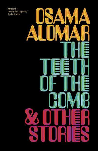
Below are some designs that art and literary critics (not us!) have chosen as the best book covers of 2017. How do your tastes measure up against theirs? (Warning: you will likely either hate all of them or love all of them!) If you knew nothing else about these stories, are there any that you would consider buying? How heavily do covers influence you when shopping for new books?
Were there any times when a really great cover led you to read a not-so-great story? Or times when you almost didn’t read a great book because of a really bad cover?
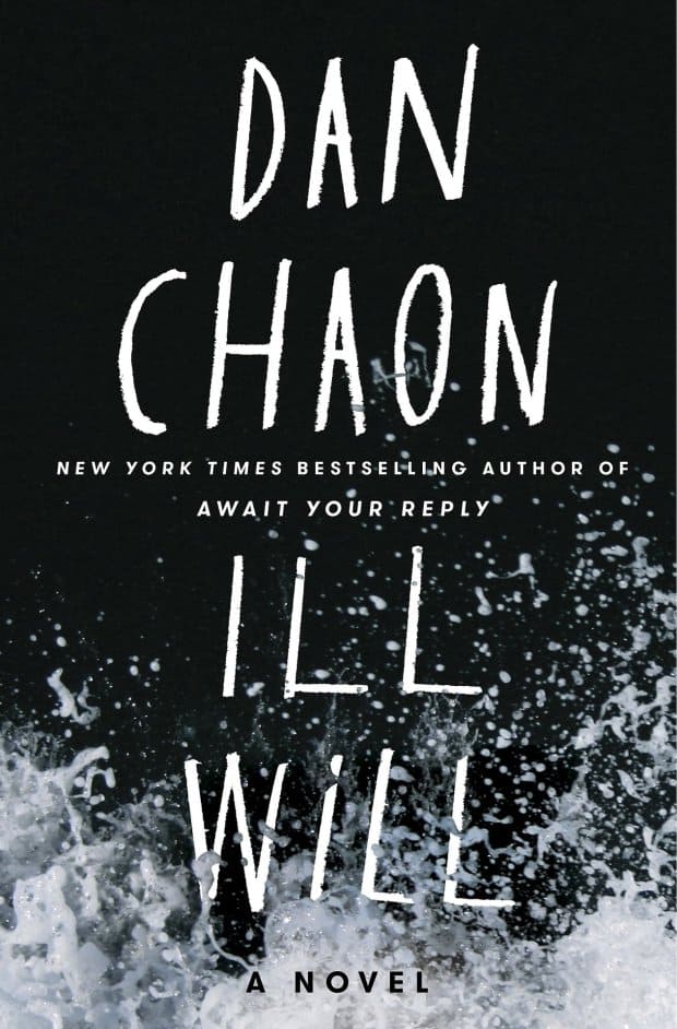
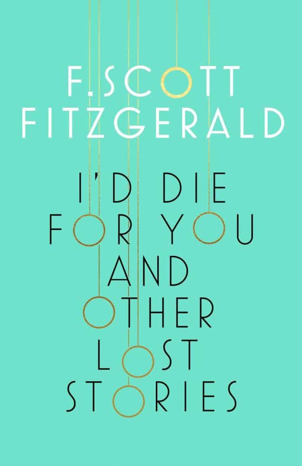
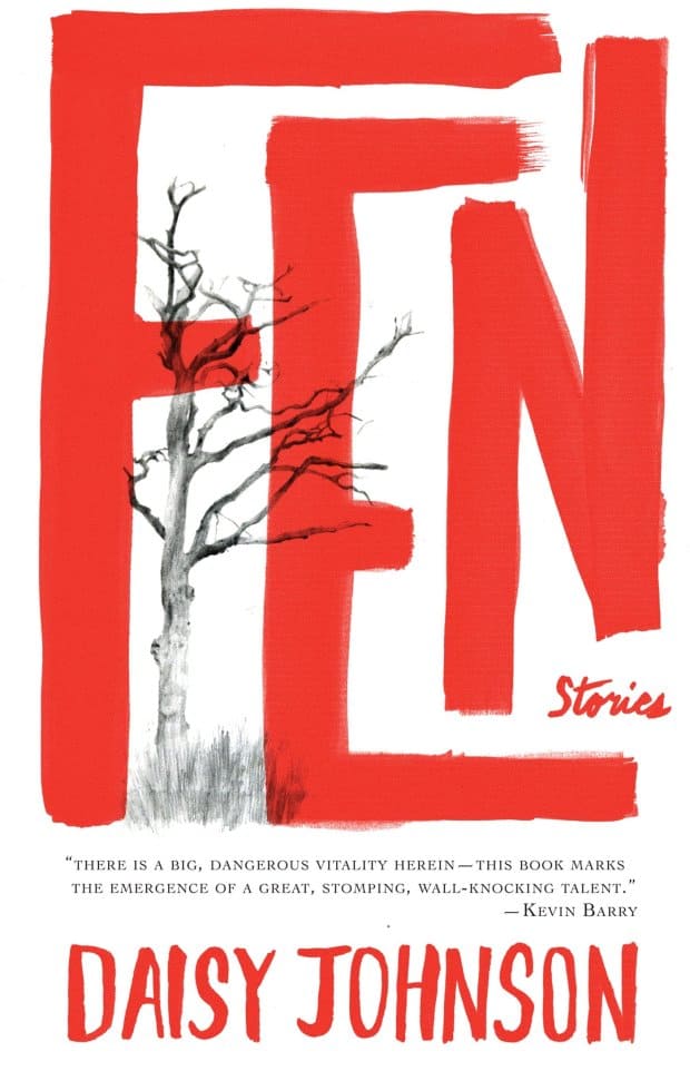
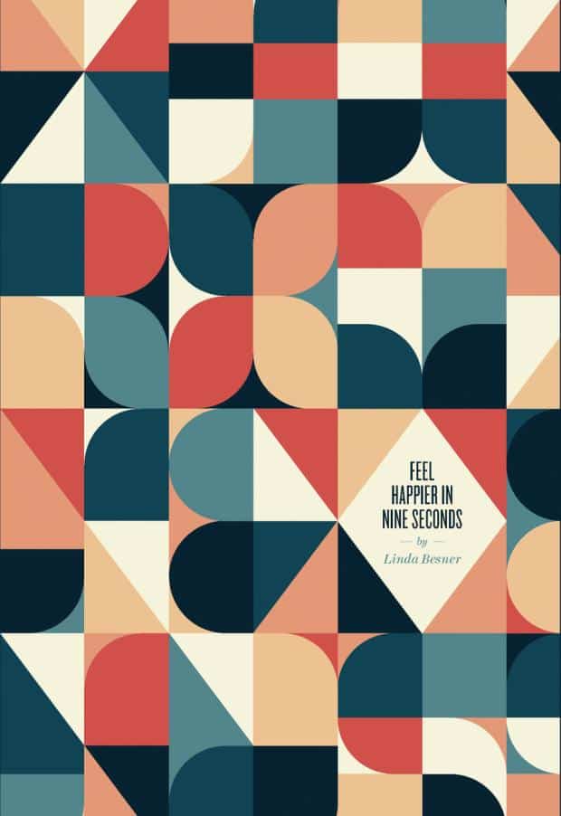
Best Book Covers of 2017 (chosen by art and literary critics)
These best book covers were found via the casualoptimist.com & pastemagazine.com. Check them out to see more new covers, or to learn more about the designers. And we’d also love to hear if you agree with these critics’ tastes. Please let us know your thoughts about how covers influence your reading below in the comments!
Do you have a blog idea or topic you know our readers would love? Contact sarah@mybookcave.com to learn how you could get your blog featured.


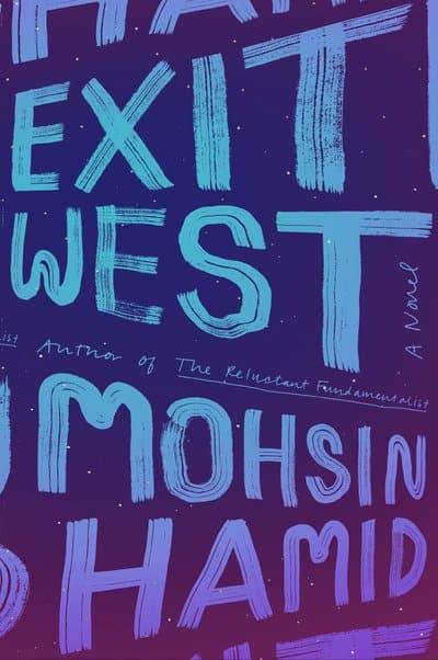
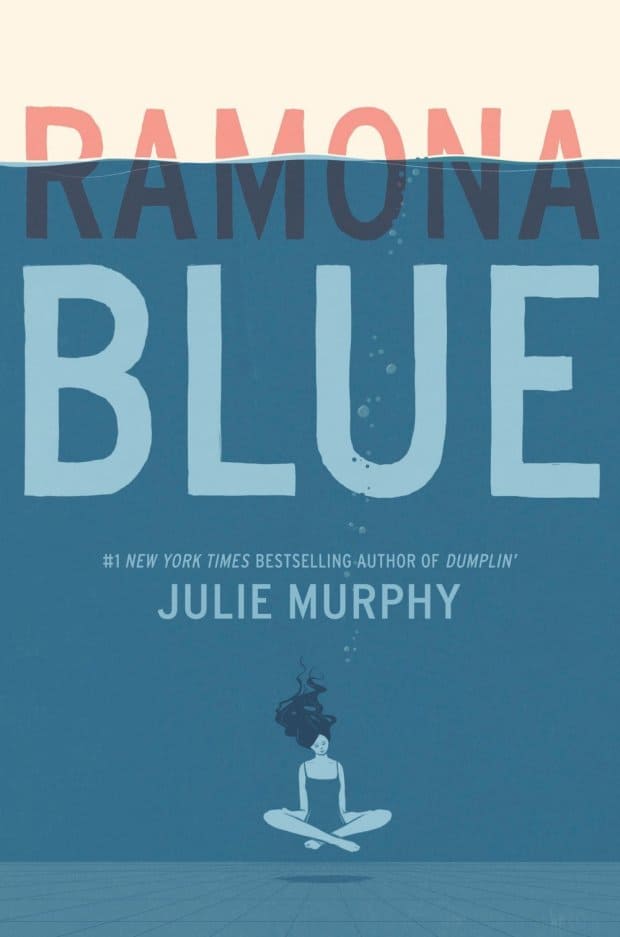
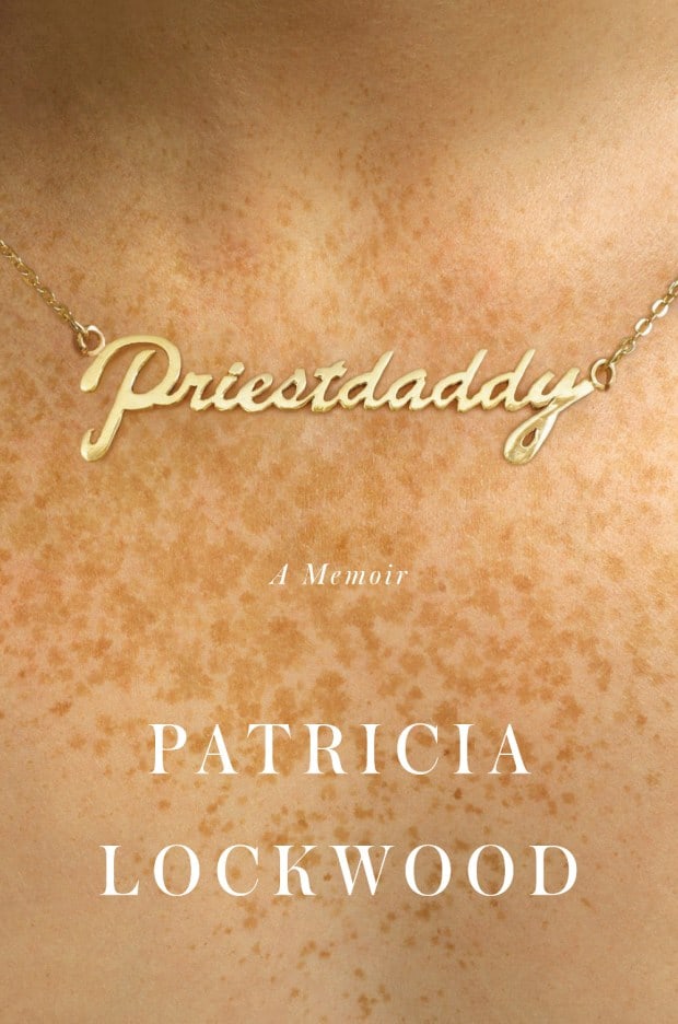
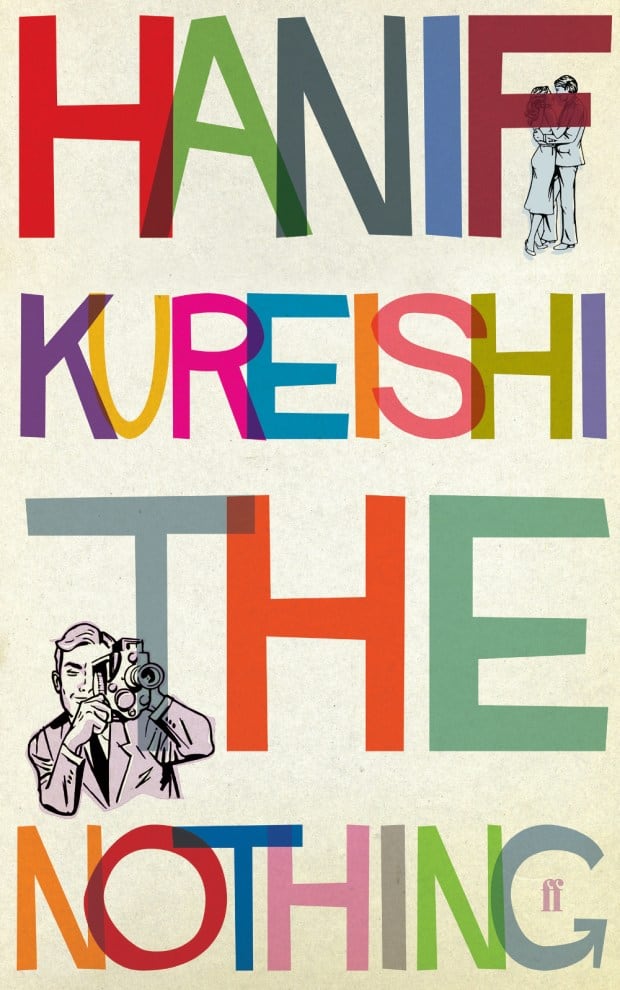











I love the book covers! Like your guys’ taste!
Jennah
I must say I do not appreciate them much but I do like them better than the covers with an body builder alpha male . I am not at all prude but I just hate those covers and usual skip those books. Perhaps the story is good but the cover disgusts me.
I found very few book covers that would inspire me to read these books.
I have to admit that these, except maybe 2 or 3, were all uninviting. Most of them look like what indie authors’ book covers used to look like when they were just getting started a few years ago — cheap, unprofessional and outdated. Great big letters or crazy-looking designs (unique does not equal good) are not what entices most people. Yes, I’ve read books with bad covers, but that’s because they had good reviews and I was looking for them. That way, I didn’t have to wonder if I was wasting money. I’d say a book cover does have to draw me to the book first, as I’m unlikely to even notice books that have covers such as shown here. Even if it is an alluring cover, if the blurb doesn’t sound like my thing or it’s a boring type of story, I’ll put it back down with no hesitation, but at least I will have checked it out. Some readers will do that, too, and there will be some who actually do want to read the book. So, basically, I know without a doubt that F. Scott Fitzgerald’s was decades ago and, back in those days, they didn’t have the type of equipment we have these days to actually “design” a book cover. Too many of these tell me that the author just didn’t care what it looked like, so long as the book got published. Classics were not designed with photos and such, at least back when they were originally published, but at least they were cheap-looking and/or tacky. It’s a shame that these authors didn’t bother to get several opinions prior to agreeing to one, as they might well have missed out on sales solely because of the cover. These portray a case of terrible imagination, in my opinion. A book cover should relate to the novel. These are just stoic in appearance — they have no personality. If some of these are present authors, I highly suggest you consider all these comments. As you can see, the greater majority disliked them all, and they would not catch anyone’s eye. Showcase the novel the way you would upon meeting another person for the first time. Do you meet that person in unkempt style or do you try to look your very best? Your book cover is meeting tons of people for the first time, so that book cover needs to speak through its design, adornments, models . . . whatever truly fits the novel. Meet and speak to their minds, saying there’s no way you’re going to pass me up. If you designed one of those covers yourself, it’s time to call in the help because you’re undoubtedly losing sales. After all that time you put into writing and editing, why would you allow your work to be so horribly represented by a terrible cover? Wake up and smell the roses! Making that mistake once can be excused; make it a second time — unacceptable and just plain stupid. You’re not doing yourself and favors; you’re putting yourself out of business.
meant to say were “not” cheap-looking AND “any” favors.
A lot of them put me offbecause the lettering was too big or were “in your face”. The only ones I liked were numbers 11 and 15 – after that I stopped counting. One thing no-one has mentioned is that Kindle Paperwhite covers [but for some reason not Kindle for PC ] cut off the top of the page, meaning many subjects have their heads chopped off. If I had to decide on the basis of the Kindle cover whether I would read that book relying solely on the cover I wouldn’t read many of them – instead I base my decision on going to the Amazon site whows the full cover and reading comments by readers as to whether the book is worthwhile reading or not.
I hated every one of these book covers. I don’t think…no, I KNOW that I wouldn’t even consider picking one of these books up to even scan the back and see what it was about. The covers alone are a quick turnoff to the book in general for me.
i would not pick any book with those covers. to me they do not relate to anything i am interested in. the book covers are too complicated for me to understand the meaning of the book/
Oh my, talk about flashbacks to the 1960s and 70s and not in a good way. Why is it that the “critics” seem happy with these bland retro designs and not we readers?
The only exception was The Never King – purely because it was at least indicative of what the book’s content was likely to be.
I pay no attention to covers, the synopsis is what’s important, but I might add that these covers wouldn’t prompt me to even check it.
I have to admit, a great cover occasionally helps me to decide on a book. If it is a new author to me, and especially if the blurb is wanting. While covers are important, I do read many of the reviews to gauge whether or not a book will be worth the time and money invested. Of the covers featured, most of them are repetitive and either too busy or too plain. It’s unfortunate that a cover should matter in my purchase, but I like smart and beautiful wrappings, which unfortunately isn’t always fair to the author. There are some classics I’ve purchased and made my choice for a decorative cover over a plain one, even though I had to sometimes pay extra for the fancy cover, and the content of the work inside was exactly the same. I’d like to say that this is only true for paperback and hard cover books, but as I scroll through my voluminous ebook library, I know that is false. I am a creature of habit, who wants a varied, smart looking book catalog, wherever they are kept or whatever format they may be. Another thought, I have an ebook series that has twelve books in all. I was quite happy with the original covers, I thought they were brilliant and a great representation of the main protagonist. The author has since updated all the covers and I really don’t like the new ones. I’m not persnickety enough to protest, but I did fancy the first ones and am sad that it was just changed after the purchase date without being given the chance to keep the originals. I thought when one made an online purchase of an ebook, it would remain the same, but it’s simply not true.
I wouldn’t have picked any of these books to read by their covers , I would read a few after reading the synopsis!
I would not consider reading any of the books show based on their covers!
Most of them are not that great. I liked the never king and born.
I agree. Most of the covers are ugly and wouldn’t entice me to pick it up. I have however picked up a book that had a bad cover but after reading the back decided to buy it and it turned out to be good and vice- versa. I used to read the last page while deciding to buy a book and decide like that lol. I’m wierd, I know. But really the cover is the first draw in.!!
I would not have picked ant of there books. The cover of a book has to catch my eye before i even look at the Blurb. It has to catch my eye or if i’m drawn to the book is really important to me.
I wouldn’t even consider reading any of these books. As a matter of fact, I wouldn’t even consider looking at the inside flap to see what they are about. Most books having an ugly or offensive cover won’t get a second look from me unless I am familiar with and like the author, in which case I would probably ignore the cover and read it. Although I don’t read books because of their covers, I will on the other hand not read a book because of its cover.
I hated all of them. If this is the best, I would hate to see their worst. I would never read any of these books based on the horrible covers.
None of these indicated a story I felt compelled to read. If they were listed as freebies, I might select two of them out of curiosity, but with low expectations.
Most of the covers are pretty awful. The only two that are at all interesting and that is 22 and 23.
Goes to prove that beauty is in the eye of the beholder. I didn’t like a single one! And wouldn’t read any of them based on the cover alone. By the way I haven’t read any of them.
I hated all of these covers and would not even consider reading them based on the cover.
Me neither
When I choose a book, I look at the cover first, then I read the blurb about the book to see if I am interested it in. If I don’t like the cover, I don’t even bother to read the blurb.
I would be hard pressed to read any of the previous books based on their weird covers.
I do Not agree with your Best Book Cover Picks for 2017! Numbers 1,2,4, 8,12, & 18 were very ugly with just lettering and shouldn’t be on the list. Number 2would be more appealing with brighter colors as with number5. Number 9 was just boring and doesn’t make me feel happy about reading a book on feeling happier. The rest of the list was pretty good and covered the various niches well.
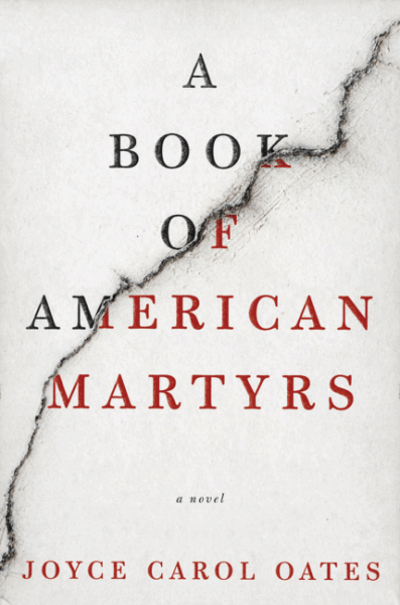
I wouldn’t pick up any of these books either, lol! Definitely look like literary novels that are marketed only to other literary novelists. I like the occasional literary novel, but for the most part, I agree with Mary Marquez. No way the average Joe (or Mary or me!) would pick these up! So down with art and literary critics, I’m sticking to my genre romance and sci-fi! These covers all look like throwbacks to the 1960s. I only like two of them: Book of American Martyrs, and The Never King. I don’t read nonfiction much anymore, but I’m sure the fiction would be interesting. I’m just as sure that I won’t seek it out because I dislike the covers. So, yeah, covers are a huge influence to me. I’m sure the designers of these literary book covers are trying NOT to attract the masses but only those who like literary novels.
Yes to both questions. I have had books I skipped over because the covers were horrible. I know it’s not fair but sometimes I think of it as a reflection of the author’s writing. At times, I’m spot on. On other occasions, when I finally push myself to open the book I’m delightfully surprised by how good the book truly is despite the cover. And vise-versa, there have been times I couldn’t wait to dive into a book because the cover was so enticing, only to find prettily wrapped garbage.
Personally, I found most of them ugly.
I agree!
Me too
Truthfully, I would not have thought of reading any of these books based on cover alone. Most seemed pretentious or just weird. I am sure these are very good books, but the covers would not make me interested enough to look further.
I wouldn’t read any of these books based on the covers. Especially at first glance. I would skip right over them to something else.
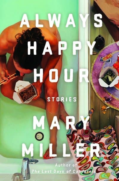
The only one that I gave a second glance, was ” Always Happy Hour” and then changed my mind. As for the rest, I would not buy any of the books on the strength of those covers.
Oh my; another case of my taste in art differing fr the judges. I would not have picked up a single book based on these covers! Really! Critics’ choice? Hmmmmmmm….
I thought almost exactly the same thing. Trying too hard to be different or relevant. Mostly just unattractive and off putting.