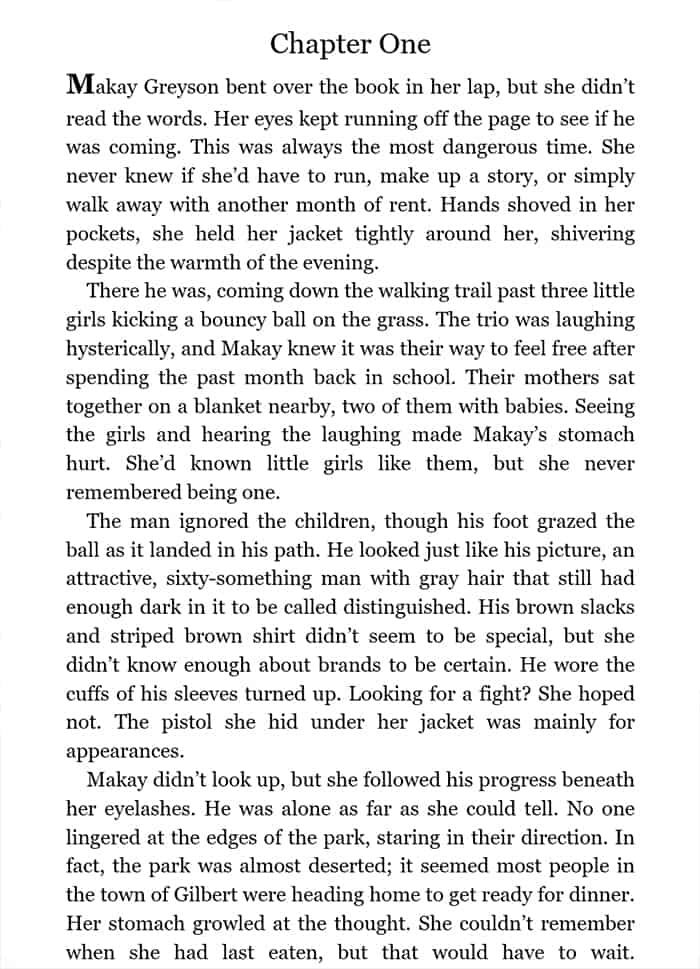
Book Cave screens every book we accept for a content-rated, discounted promotion. We have a list of things we look for before we even begin to read the book, and one of these includes formatting. Early on, we were surprised at the variations submitted, and after deliberation, we opted only to promote books using the standard that all large publishers use, which is also the formatting that most resembles the formatting of a print book.
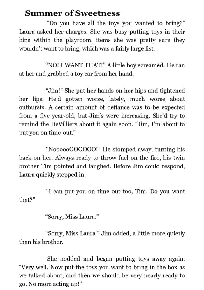
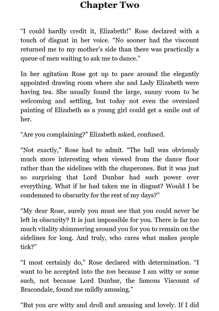
Block formatting is one of the variations we see (at this writing, approximately 3 in 100 submissions). While block formatting is great for blogs and emails, we strongly recommend that authors not use this formatting in ebooks.
Who cares about formatting?
But who cares about formatting? It all reads the same. Well, yes and no. Many books are read on phones these days, and that extra spacing between paragraphs can be irritating, especially if readers are enlarging the font because of poor eyesight/reading conditions. It requires more page turns, and the gaps can be confusing. Avid readers accustomed to print books are often annoyed at the extra spacing because it has historically signaled a scene break. Yes, some books do use symbols to set off scene breaks, but spacing is used just as often.
Block paragraphs is sometimes an indicator of other issues
Because it is used so rarely in ebooks, block formatting often signals to us that an author is new and may not have other important things in place like plot, proofing, etc. However, some small publishers do use block formatting, so don’t automatically assume your publisher didn’t do a good job with your book. But the fact remains that major publishers and savvy indie authors nearly always use formatting that resembles the text in a print book. That means no spacing between paragraphs and indentations on all paragraphs except the first paragraph after each chapter or scene break. (Note: in the early days, ebooks used indentation on first paragraphs, and we do accept books that have first-paragraph indenting, but why not change that when you format your next ebook?)
Most ebooks don’t use block formatting
Before making our decision and writing this article, we looked in hundreds of books, and you know what? You never, ever see a print book by a traditional publisher (ebook or print) with spacing between paragraphs, unless it’s nonfiction with headings, and even then the paragraphs within each section don’t have that spacing. Yes, again, there are new indie authors who are doing that, and that’s another reason why it’s important not to do it. You don’t want to appear to be inexperienced.
Block paragraph with and without paragraph spacing
Some of these books with spacing between paragraphs will have paragraph indentations on all the paragraphs and some will have none. Normal block formatting isn’t supposed to have paragraph indentations (think emails), but book readers do expect them (except for first paragraph of each chapter as noted above). But to have block formatting and paragraph indentations is redundant. Better to get rid of the extra spacing and have a smooth, uninterrupted reading experience. It’s hard enough to sell books these days with all the competition. Why make it harder?
This is why Book Cave looks at ebook formatting before we approve books for promotion. Not only do we want to offer readers movie-like ratings for books so they can have realistic expectations (that should result in better reviews for authors), but we want the actual reading experience to be enjoyable for them in other ways as well.
Go check your ebook preview
You should always, always, always, check how your books looks in the preview on at least a couple of your vendors. Amazon, Barnes & Noble, Google, etc. make this easy to do. Just go in and click on your book. Does your text look good there? If not, it’s likely going to be odd on at least a few devices. Keep in mind that if your book interior comes through on a preview as a jumbled mess, it will sell fewer copies. Most people won’t download it on an ereader to see if it’s better there.
Then download a sample to your ereader and also to your phone. How does it look there? If it’s not right, fix it. Again, you are battling so many other reader distractions, why give readers more incentive to put down your book? Instead, make it easy for them. Don’t remake the same mistakes that people already made before the standards were set. Good formatting is a simple fix.




I write nonfiction how-to guides and use a lot of list items, callout boxes, and short paragraphs (and, of course, subheadings). Basically, the kind of writing that is well suited for online reading but much longer. I find the standard formatting looks pretty awful and thus opt for block formatting (with no indentations). It’s not because I don’t know what I am doing, but rather a conscious choice.
JB, this makes sense–nonfiction that has lists, callouts, etc., does look better with block formatting. It’s fiction that we like to see with the standard indent formatting (and some nonfiction, such as biographies). A block formatted cookbook, as another example, would look very weird!
Very helpful. Thank you!