
Now that we have the file created and the image perfected, it’s time to add text to your cover design! Keep in mind as you do so, though, that if you set up a bleed like we talked about in the last tutorial, you’re viewing the entire image before it’s cropped—so be careful not to place your text too close to the edges.
Some Font Basics
Before we continue, let’s establish some terms. There are four basic types of fonts: serif, sans-serif, script (handwriting or cursive), and decorative (basically everything else—the fun fonts!). A serif font has serifs, or small decorative details or flourishes, at the ends of the letters. Sans means “without,” so the sans-serifs don’t have the flourishes. The font that makes up this blog post is a sans-serif font.
The fonts you choose are influenced by the genre of your book. Romances usually have a script font for the title, horrors often use a decorative font (a scary-looking one) or a sans-serif font, fantasy usually use a decorative font (a more whimsical one) or a sans-serif font, and mystery often uses a bolded sans-serif font. You may want to look back on the notes you took in the very first cover design tutorial to help decide what types of font to use on your cover.
You can find free fonts on dafont.com or fontsquirrel.com, but be careful! Fonts are copyrighted just like images are, so if you download a font from these sites, make sure it’s listed under public domain, 100% free, or free for commercial use (you can narrow your results with these specifications). If you choose fonts that are not free for commercial use, you can still use them if you pay the designer for the license. Generally, the paid fonts you find on these two sites will not be that expensive to purchase.
Photoshop Font Tips
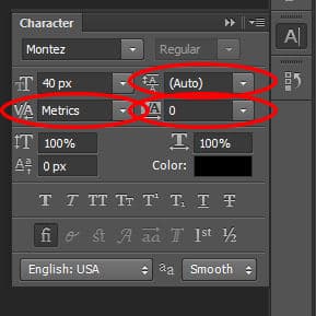
Because Photoshop is not a layout program, some of the type options are not very intuitive. When putting in type, make sure to have the Character window available (go to Window –> Character). From this window, you can adjust the regular things like font face, size, and color. But those can all be done from the top bar in Photoshop as well. What’s really useful about this window are the options circled below. The circle on the left shows kerning: by adjusting this number when your cursor is between two letters, you can adjust the spacing between those letters. The top right circle shows the leading, or the spacing between lines. You’ll most likely need to adjust this—the default usually leaves too much spacing. And the circle on the bottom right shows tracking. With all your text selected, adjust the number here to increase or decrease the spacing between all the letters.
Cover Design Elements
Okay, moving on! Choosing and placing your fonts can be simplified into three design elements: contrast, alignment, and repetition.
Contrast
When choosing fonts, the biggest thing you want to keep in mind is contrast. Back in school, when we didn’t use enough contrast, my design teacher would always tell us, “Don’t be a wimp!” So, I’m giving you the same advice: use contrast and “don’t be a wimp!”
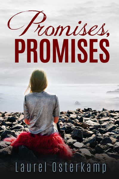
Contrast in font type: The book title and the author name are the biggest text elements on the cover (other elements might include series name and number, a subtitle, or a small quote). If you use a script font or a decorative font for your title, use a sans-serif or serif font for your name. If you have a series title, you might use a sans-serif or serif font to contrast with the font of the title.
Here are some examples of covers that use contrasting fonts:


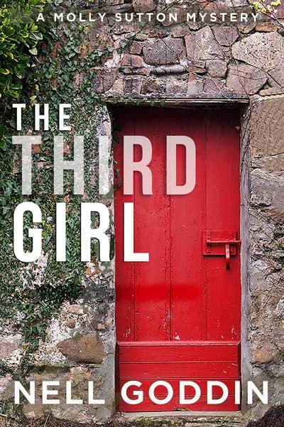
It is possible to create font contrast using the same typeface and bolding one element and not bolding the other. The minimal contrast in font type can be made up for with more contrast in color or size. These two covers below don’t use contrasting typefaces, but they make up for it by using contrast in size and color, respectively. This technique is common in the thriller and mystery genres.


For now, try out contrasting fonts, then experiment more once you have your basic design down.
In general, don’t use two fonts on your cover that are different but very similar. For example, don’t use two script fonts—they do not provide enough contrast, and if they’re similar enough, it might look like you put in the wrong font on accident.
Take a look at the cover below. The contrasting fonts in the title are very interesting. Imagine, though, if the designer had used two cursive fonts instead. The effect simply wouldn’t be as engaging.
Contrast in size: Something must be bigger than everything else. Let me rephrase that. Something needs to be noticeably bigger than everything else. The largest element is usually the author’s name or the title. Unless you have a mega popular series, the series name, if included on the cover, needs to be much smaller so it doesn’t compete with the cover’s main focus.
You can also create contrast in size within the title. A lot of designers make the articles and prepositions in a title a smaller font—sometimes even a different font. Feel free to experiment!
These covers use contrasting size within the title and between the title and the author name to create a dynamic effect. The second one even uses a contrasting color to bring the eye to the word “Star.” Notice that even though the alignment is different for the text elements in the second image, the right side of the word “Door” still lines up with the right side of the author’s name. We’ll talk more about this in the alignment section. Both covers also use contrasting font faces and color.


Contrast in color: The biggest text element on the page should also have a color that pops and immediately attracts the eye. That color, though, depends on the image you’ve chosen, and it may even be white. I suggest avoiding neon colors and the pure primary and secondary colors—instead, try using the color picking tool in Photoshop to grab a color directly from the image (we’ll talk more about this when we talk about repetition).
The other text on the page should also have enough contrast in color that it doesn’t just blend into the background image.
These two covers below take very different approaches. The first cover uses a purple-pink color pulled from the image, and the second uses a gold color that is complementary to the purple of the image (opposite on the color wheel). Notice that neither use pure primary or secondary colors. Both approaches work great—choosing a monochromatic color (same color as the background image, but perhaps lighter or darker) or choosing a complementary color. And they both use the color white because it contrasts well with the background image. If the first image were to use the purple-pink color for the entire title, it wouldn’t contrast as well and it wouldn’t look as good.


Alignment
Where do you place your text? Today, most covers place the authors name centered at the bottom. That’s not a bad place. But centering the title as well can lead to a stale and uninteresting design. Try instead experimenting with left or right alignment for your title, or maybe write on a curve. But you may find that centering the title is what works best.
A word of caution, though: the text on your cover needs to be balanced, so don’t throw all sorts of different alignments on there. More than three is probably too much. Among those three, the text should still line up somehow. For example, the author name might be centered, and the title right-aligned, but the right edge of the title might still line up with the right edge of the author name. A subtitle or series title should line up on the left and right with the title itself, or at least be centered below it. Not aligning your elements in some way will lead to the cover feeling chaotic and just thrown together.
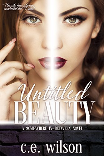
The designer of the first cover below left-aligned the title, but you’ll notice that the left edge of the title still lines up with the left edge of the author’s name. (By the way, this cover also doesn’t use different font faces for contrast; instead, it uses size and color—or transparent color, rather). The second cover, though, demands center alignment because the image is so symmetrical, especially with the dividing line down the center.
The cover image itself will often help you decide how to align your text. For instance, the cover below, while interesting, might benefit from having the title right aligned in two lines next to the man’s face, where there is more room.

Repetition
Another way to express “repetition” might be “balance.” You can balance your cover by repeating elements. You might balance a title and subtitle by repeating the same alignment. You can easily use tracking (the control that adjusts the spacing between all the letters in a highlighted section) to make them the same width.
An important element of repetition is font face. While contrast is very important, don’t go overboard. A good rule of thumb is to avoid using more than three font faces. If that means you need to repeat a font, then go ahead and do it.
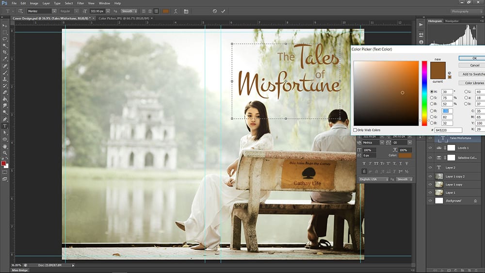
You can also balance the color on your cover by repeating a color that shows in your chosen image. To do this, select your text with the text tool in Photoshop, then click on the colored box at the top in the menu bar. A popup titled “Color Picker (Text Color)” will appear, and when you move your mouse to the image, the arrow will turn into what looks like an eyedropper. Just click on the image and it’ll change the text color to match the spot you clicked on. You can click as many times as you want to get the color just right, or even slightly adjust the color manually after “picking” it.
Here are two covers that use colors pulled from the image itself:


Repetition is important when designing covers for a series. All your series should use the same fonts for the same text elements. Keeping the same alignment is usually a good idea as well. The differences come with a different image (though similar in feel) and different colors. Here is an example of a series (Lily’s House) with covers that use repeating elements:


Using Blending Options on Your Type
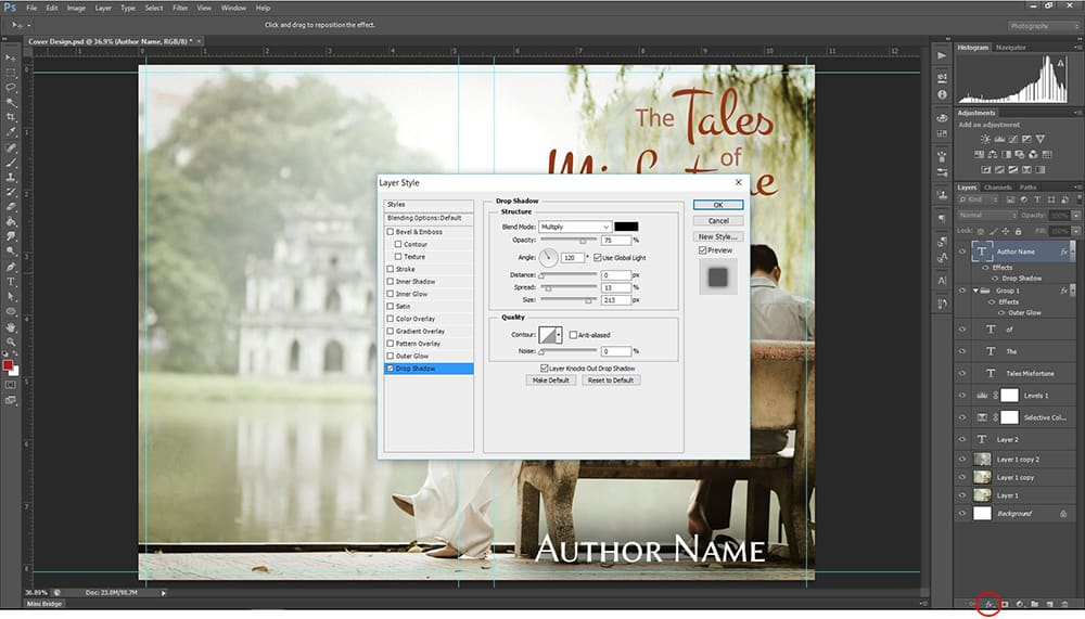
I’d like to show you one more neat feature in Photoshop that you can use in your cover design: Blending Options. With a text layer selected, right click on the layer or go to the fx dropdown that appears at the bottom of your layer panel, then choose “Blending Options.” A popup will appear. On the left are all your blending options—click on one to turn it on, then adjust the settings that appear on the right side.
My very favorite is the drop shadow. If the background is just a bit too light and your text is hard to read, you can create a faded shadow around your text with this setting. Set the distance to zero, turn up the spread a bit, then turn up the size even more (you’ll have to experiment to get it just right for your image). By clicking on the color square, you can change the color of the shadow. You can also decrease the opacity if the shadow is too dark and experiment with the contour or the blend mode (which is also way cool). The resulting shadow looks like part of the image and isn’t noticeable to viewers, but it makes the text much easier to read. You can do the same thing with the outer glow if the background is a bit too dark for the text.
Also note that at times the blending option isn’t quite enough and you’ll have to create another layer underneath your text layer, select the space to be filled with the rectangular marquee tool, fill the section with a darker or lighter color, deselect to get rid of the marquee selection, and then blur the layer (I like to use the Gaussian blur). You can adjust the layer opacity or use your eraser (or a mask) until it’s just right.
The beautiful image below needed a dark shadow on the top to bring out the white title. Currently, it uses a transparent black rectangle, but it might really pop using the drop shadow technique discussed above (with maybe a steel blue color picked from the darker part of the picture for the shadow).

You’ll also find the settings for Bevel and Emboss in the Blending Options. Bevel and Emboss has been decreasing in popularity, though, so if you use it, be subtle and make sure to check out what other people are doing with the best-selling novels in your same genre.
Wrapping up . . .
When evaluating your cover, make sure you look at it large and small. It needs to look good in both formats, and it needs to be readable. No matter how beautiful the cover is, if the title and author name are not readable, then it’s back to the drawing board. Keep in mind that some colors (particularly red) do not translate well on many vendor sites. Meaning they may look fine on your computer screen in Photoshop but be blurry on your book listing. Don’t be afraid to change it.
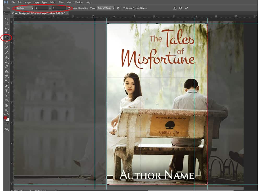
For the print cover, you’d use this file (after adding spine text, back blurb, and barcode) to make a print-ready PDF. But for your ebook cover, you’ll need to crop the document down to the actual cover size and save as a jpeg. Make sure not to accidentally save over the original! Many designers save their files first to a secondary file before flattening and making the PDFs and jpegs, just in case they make a mistake. You don’t want to start over!
And by the way, if I were really making the above image into a book cover, I would take out the sign on the back of the bench using the clone tool, or I would put something else there that might go better with the contents of the book.
Don’t be afraid to experiment! Photoshop allows you to turn on and off layers, so you can create different layouts with your fonts to see what looks best. And it’s always good to ask someone else’s opinion on your final cover design (preferably someone who enjoys reading the genre you’re creating the cover for). Good luck, and have fun!







I cannot write on my book cover, I can download a picture but cannot write on the picture or the back Book cover. what do I have to do in order to be able to write or edit on my book cover
Hello,
Have a simple question. When type is recessed from the surface on a book cover (blind emboss), do they look better on lighter or darker colors?
Thanks
Daniel